Preventing Workplace Burnout with a Mental Well-being Tracker
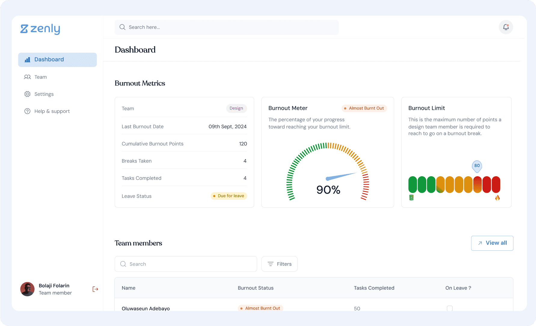
Overview
Zenly fosters mental well-being in creative teams by tracking individual work and estimating burnout levels. It anticipates burnout based on the mental difficulty of completed tasks
Deliverables
There are three user categories for the product, with each category having different levels of access on the Zenly app. These categories are :
Admin Module: can edit data for all teams.
Team Lead Module: can edit data for their team only and can edit data for their team only.
Team Member Module : Can only view data belonging to their team.,
Crafting a solution
With a well defined brief provided by the client in place, we concentrated on implementing an organized approach to design through these stages:
Brainstorming
During brainstorming, the team aligned to thoroughly analyze and break down the brief, while assigning tasks to ensure comprehensive project completion.
High Fidelity Prototypes
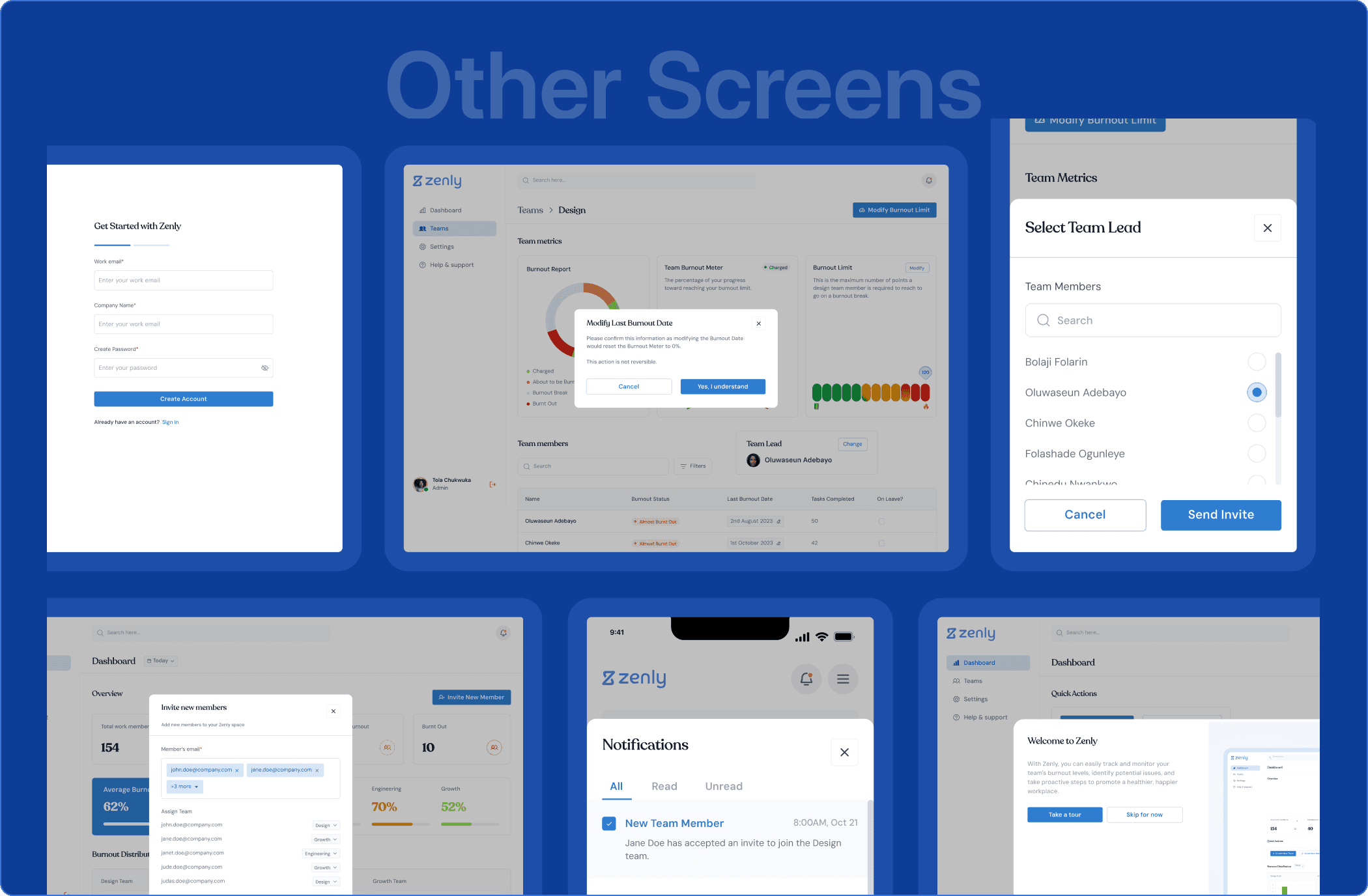
Given the tight 3-week timeline, we moved straight to high-fidelity wireframes, skipping the initial wireframing stage. We held weekly meetings with stakeholders to ensure our designs and solutions aligned with their expectations. The designs were then prototyped and prepared for developer handoff, ensuring pixel-perfect implementation.
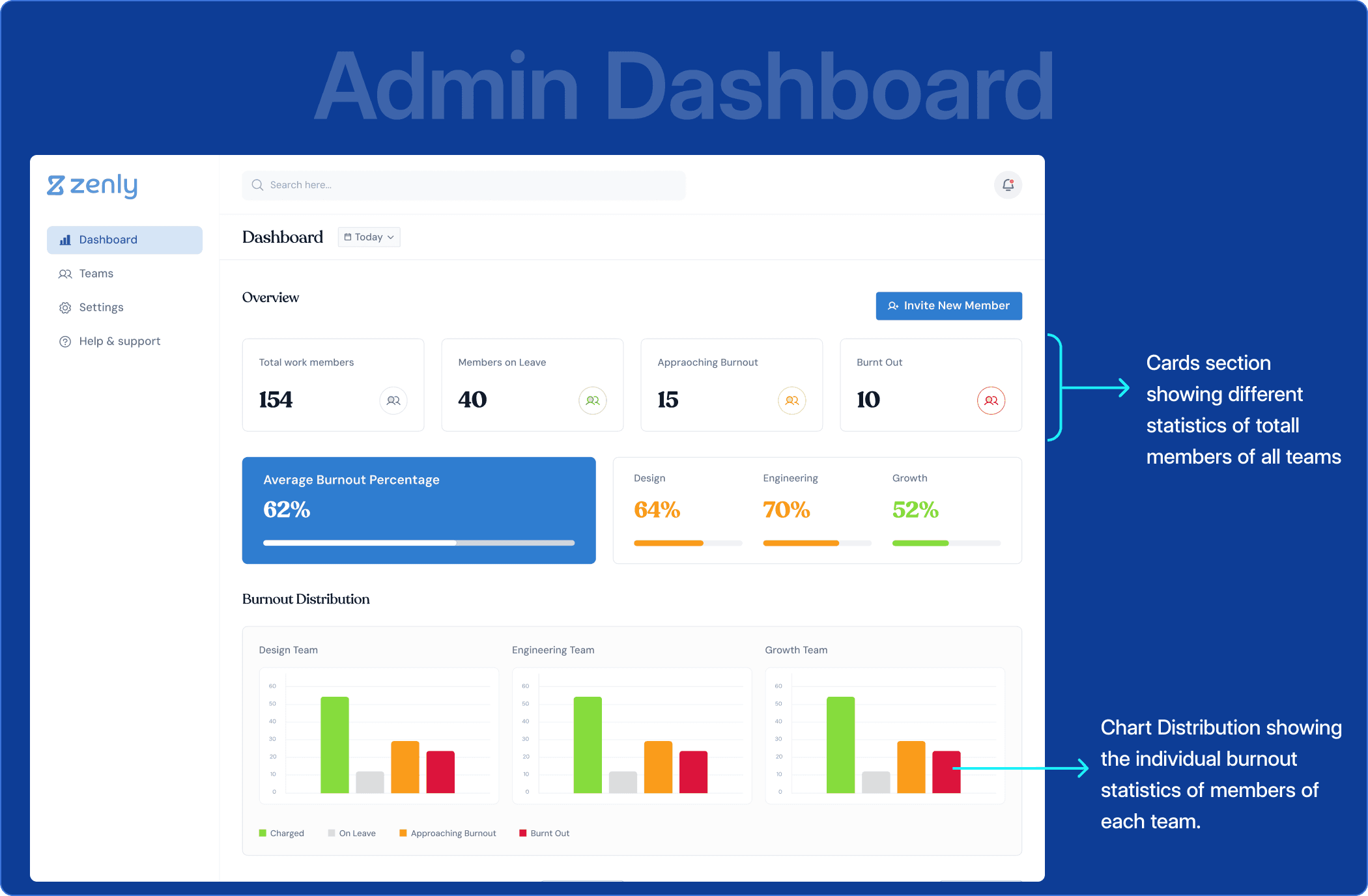
Admin Dashboard: The Admin Dashboard provides a centralized hub for managing and monitoring team well-being across the organization.
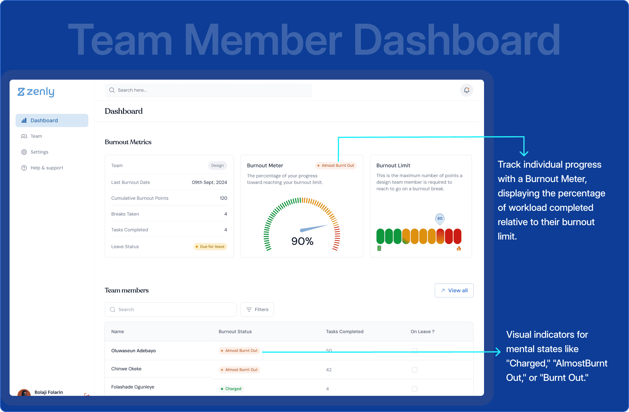
Team Member Dashboard: The Team Member Dashboard is thoughtfully crafted to keep team members informed about their mental workload and well-being. By presenting key metrics at a glance, it ensures vital information is easily accessible without overwhelming the user.
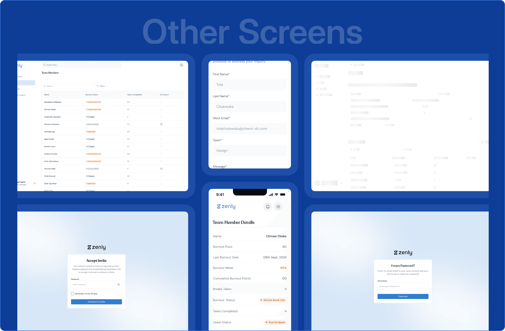
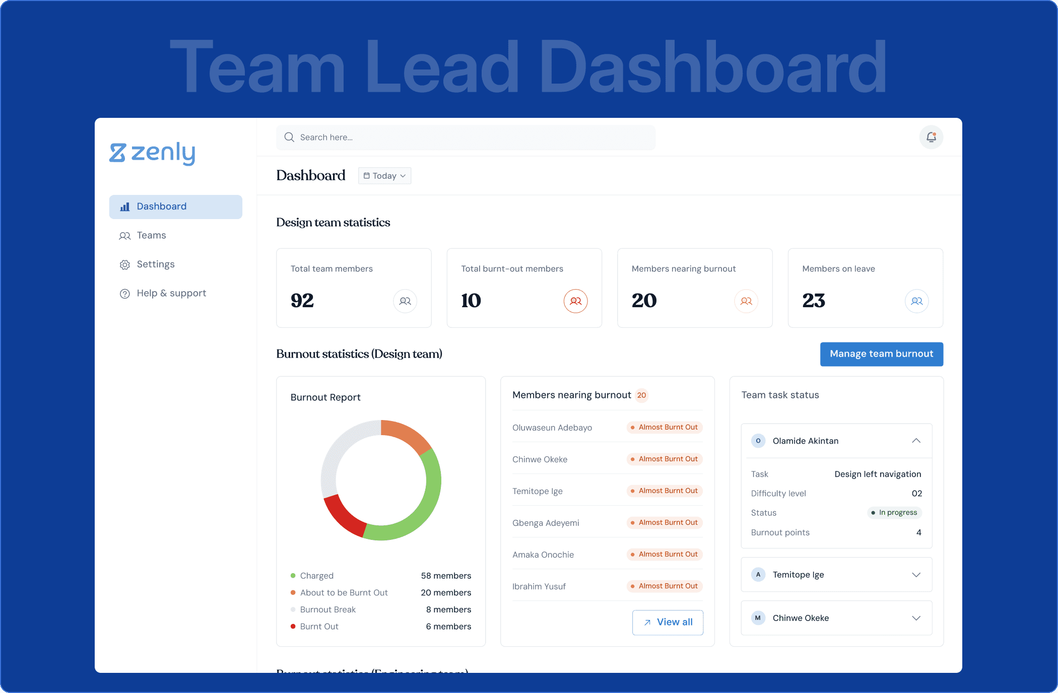
Team Lead Dashboard: This dashboard equips leaders with the tools to monitor their team's well-being and take proactive measures to prevent burnout.
Challenges
Working with a Detailed Plan: We didn’t have time for research or wireframes, so we had to work together as a team to understand and follow the project plan carefully.
Keeping It Simple but Useful: We had to design dashboards that were easy to use but still showed a lot of important data. This meant focusing on the most important numbers and using clear visuals.
Learnings
Designing for Users is Key: Making the dashboards simple and easy to access helped ensure they were both useful and easy to understand.
Finding the Right Balance: We learned how to show a lot of data without making the dashboards confusing by focusing on what mattered most and using clear visuals.